


Blush Rush
This Month’s Makeup Review
September 3, 2018
Nearing homecoming season, we are ALL looking for that perfect blush and highlight combination, relentlessly searching for the ultimate balance. How will you find your ideal match OR do you already have it?
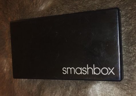
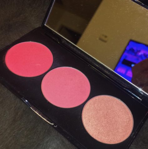
The Smashbox “L.A. Lights” blush and highlight palette in the overall shade “Pacific Coast Pink” is NOT my dream blush and highlighting combination. The component contains three small pans – two blushes, one highlighter. Costing $35.00 at Sephora, that brings each pan to about eleven or twelve dollars. In this pallet, the powder blushes are very saturated and pigmented, maybe even a bit splotchy once examined upon application, depending on the shade chosen.
“Rich Pink” is a fierce, hot pink tone that I strongly advise applying lightly with a thicker, angled fan brush. This shade is a little too overwhelming for me, personally. A lighter, less heavy, more airy looking blush in the pallet is “True Pink” and it is just that. I like this shade for a day when I go for a subtle, “no makeup” makeup look.
Finally, the highlighter – shade “Highlight Pink” (lovely creativity with that one). As a blush topper, this could be cute but because it’s said to be a highlighter, it does not grab my attention as much as other highlighting products. Seeing as “Highlight Pink” has little to no sparkle, if you’re into a more natural, subtle highlight, I would say pick it up. It leaves behind some illumination and it is pretty, it just isn’t what I prefer.
The Smashbox “L.A. Lights” blush palette is not MY perfect blush/highlight combination, but I wouldn’t say I don’t recommend it. They don’t swatch well, but the products are very good quality and the packaging is relatively simplistic but comes with a mirror. For me, the blushes are too overwhelmingly pigmented and not as blendable as I like – and the highlighter is not as “blindingly” shimmery as I prefer. This blush and highlight trio by Smashbox may not be my ideal combination, but I can contribute to helping you find yours.
FOR FAIRER SKIN TONES: Depending on your undertones, gravitate toward more soft pinks, light corals, and peachy tones. These colors will just add a little bit of color and dimension to your features.
FOR MEDIUM SKIN TONES: Try rich pinks, mauves, and deep peach tones. These colors should compliment your undertones and other features (hair, eyes, etc.)
FOR DARKER SKIN TONES: A deep fuchsia, tangerine, and warm brown shades
– depending on your undertones – should add the right amount of color to your cheeks and make you feel beautiful.
Most importantly, remember that makeup is around to make you feel beautiful. You are not obligated or expected to wear it and you are just as stunningly gorgeous with it as you are without.
 Photography, Gina Wagley
jessejames • Sep 3, 2018 at 11:06 pm
i was looking to buy my girlfriend some makeup like this & this review definitely helped.